Saturday, May 31, 2014

Baby Shower Gift Set

This afternoon I attended the baby shower of a dear friend from college who is expecting twin boys!! Even though she lives over an hour away and we really only see each other once a year, she's really the first of my close friends to start a family. I'm super excited and I've been working on her presents for a few weeks now.

She told me she was pregnant by telling me to get my knitting needles ready, so I knew I had to knit something! :) I was going to knit a pair of baby blankets, but at the time I was trying to decide what to make, that just seemed a little too overwhelming because I was working on a million other projects. So, hats it was! (I used the Easy and Basic Baby Hat pattern on Ravelry.) I already had this super cute variegated yarn in orange, aqua, brown, and white. So cute, so boy, and so different from most baby yarns! And then I remembered that I happened to have flannel in the same colors already cut and ready for a quilt I meant to make like three years ago! Perfect!


Since I suddenly had such a cute little coordinating set, I decided to roll with it. I pulled out a bunch of inks - Tangerine Tango, Pumpkin Pie, Soft Sky, Pool Party, Bermuda Bay, and Chocolate Chip - and a couple stamp sets and went to town! :) Here's what I came up with...


Card Details...
Stamps: Simply Stars (Stampin' Up! - retired), Cuddles and Kisses (Stampin' Up! - retiring, but still available and on sale!), Just Sayin' (Stampin' Up!)
Accessories: White Baker's Twine (Stampin' Up!)
Cardstock: Whisper White and Tangerine Tango (Stampin' Up!)
Inks: Tangerine Tango, Pumpkin Pie, Soft Sky, Pool Party, Bermuda Bay, Chocolate Chip (all Stampin' Up!)


Tag details...
Stamps: Simply Stars (Stampin' Up! - retired), Handle with Care and Purls of Wisdom (Papertrey Ink)
Accessories: Angled Tag Topper Punch (Stampin' Up!), Pool Party Baker's Twine (Stampin' Up! - retired)
Cardstock: Whisper White and Tangerine Tango (Stampin' Up!)
Inks: Tangerine Tango, Pumpkin Pie, Soft Sky, Pool Party, Bermuda Bay, Chocolate Chip (all Stampin' Up!)

Pretty cute, if I may say so myself! Unfortunately, I couldn't find wrapping paper that matched. But I did find some that has big polka dots like the one fabric in the quilts, and it has orange and aqua in it - along with a bunch of other colors, but oh well... I'm going to use orange and aqua ribbon. :)

Thanks for stopping by today. I really hope you enjoyed this project - even though it's a little different from what I usually share. Yup, I knit, and sometimes I sew... I've always got some sort of projects going on! :)

Happy Stampin'! :)

Tuesday, May 20, 2014

Occasions Catalog Favorites: Peachy Keen


Here's a cute and simple card I made with the Peachy Keen stamp set from the Occasions Catalog, and the coordinating On Film Framelits. I also used the super fun Retro Fresh DSP collection both on my card and as an inspiration for the colors I chose.

This card is really very simple and doesn't take much in the way of explanation. The card base is Coastal Cabana, and then I layered Sahara Sand and Very Vanilla. I cut the filmstrip die with Baked Brown Sugar, and stamped on a layer of Sahara Sand which I adhered behind it. I stamped the greeting with Baked Brown Sugar, Tangerine Tango, and Coastal Cabana markers. The heart is clear embossed on Tangerine Tango cardstock, giving it a great shiny, tone on tone look. 


A little bow of gold baker's twine finishes off this cute and very mailable card!

If you like this card, you'll want to know that the Peachy Keen stamp set and Retro Fresh DSP will only be available until May 31st! That's less than two weeks! Visit my website if you'd like to place an order.

Happy Stampin'! :)

Sunday, May 18, 2014

Start-to-Finish Sunday #38: Project Life by Stampin' Up!

I know it's taken me a few weeks, but I promised you a video on how I do my Project Life layouts. So today, here it is! :) It was a little different for me... I think I was a little self-conscious of what I was doing since I was filming the whole time, plus this was the first layout I did with the Stampin' Up! Project Life supplies. They're very similar to the supplies I've used in the past, but I'm just not familiar with them yet, and the page protector layouts are a little different from what I'm used to. So when you start the video, be aware that before I started filming, I'd already tried out my photos for the week in a few of the different page layouts, and I picked the one I thought worked best.

Another thing that tripped me up a little was the sheer number of cards I had to choose from! Now, I know, this is a totally amazing thing. But it was hard to choose! So bear with me as I'm flipping through multiple times. :) The Becky Higgins Project Life Core kits that I've been using for the past year have tons of cards, but they also have way more duplicates. It seems that the Stampin' Up! kit only has two duplicates (if any) - a horizontal and a vertical orientation of the design.

So anyway, that's enough blah blah blah! Here's the finished layout that I make in the video.


I really wanted to keep it very simple - minimal embellishment, minimal stamping - to show you just how amazing your layouts can look with pretty much only the adorable cards and your awesome photos. (Note: ALL the photos on this layout were taken with my iPhone 5, and not always under stellar conditions. Check out my blog post on cell phone photo resources for Project Life here: http://bit.ly/RNaKSa


You can watch the start-to-finish video below, or over on my YouTube channel. Enjoy, and feel free to leave a comment or email me if you have any questions!


Here are the products you'll see used in this video:

Everyday Adventure Project Life Card Collection #135298 $15.95

Everyday Adventure Project Life Accessory Pack #135301 $9.95

Variety Pack 12x12 Photo Pocket Pages #135294 $6.95

Project Life Journaling Pens (set of 2) #135304 $4.95

Remember This & That Rotary Stamp #130133 $5.95

And just as a little bonus for those of you who scrolled all the way down to the bottom of this post (lol!), here is the next week's layout, which is on the back of the video layout.


Happy Scrapbookin'! :)

Thursday, May 15, 2014

Occasions Catalog Favorite: Vivid Vases

In every catalog, Stampin' Up! offers a small selection of single stamps. They're usually only available in wood mount, and feature an image and a greeting. Vivid Vases is one such single stamp from the Occasions Catalog, and it happens to be one that I totally adore. Now, I will be upfront with you and say that this stamp will carry over into the 2014-2015 Annual Catalog, so there's really no rush on this one. But at only $11.95 for a beautiful and generously sized stamp, it's a great addition to your order... Maybe you just need a few dollars to bump your order to the next level of Hostess Benefits? ;)


I decided to keep this card extremely simple, because I wanted the coloring to really take center stage. This set is so awesome for whatever your favorite coloring technique may be... in this case I chose to color it using inks and a blender pen. I used Pool Party, Calypso Coral, Wisteria Wonder, Crushed Curry, and Gumball Green inks. And P.S. - Gumball Green is retiring but at this time the ink and cardstock are still available so get them while you can!


Try watercoloring the stamp, or paper piecing the vases with your favorite DSP! Quick and simple, and the results are oh-so-cheerful!

To finish off my card, I used a layer of Calypso Coral, and two little banners that I punched using the banner punch from Sale-a-Bration. Guess what! That awesome little punch will be returning in the 2014-2015 Annual Catalog! I can't wait! :)

You could easily take this same card design and "step it up" however you like... Add ribbon or twine. Or maybe a button or other embellishment. Add more layers of cardstock. Emboss the card base with an embossing folder. Or just keep it sweet and simple!

Happy Stampin'! :)

Monday, May 12, 2014

Occasions Catalog Favorite: Hello, Sailor

The Occasions Catalog run is winding down: Many products from this catalog will only be available until June 1, 2014! Yes, some of them will be carried over into the new 2014-2015 Annual Catalog, debuting on June 2nd, but that is not the case with everything. So if there's something you think you can't live without, make sure you get your order in by June 1st!

I've got some cards on deck to share with you guys, so my plan is to post them over the next few days, showcasing some of my faves from the Occasions Catalog, whether they will be carried over or not. Sound good? Let's get started! :)


One of my most favorite stamp sets in the Occasions Catalog is called Hello, Sailor. It's so cute! It has awesome nautical images and sentiments. This little whale is so cute!

I also used the High Tide DSP, which coordinates perfectly with the stamp set. It has some really unique and beachy colors and motifs, but I chose to go with a more traditional palette of red, white, and blue, with some weathered gray. Specifically, I used Pacific Point, Real Red, and Smoky Slate. On the card base I used a Stampin' Sponge to ink around the edges to echo the distressed feel of the DSP.


To create the two-tone look on the adorable whale, I inked him up with Smoky Slate ink, then took a sponge dauber and sponged around his edges with Pacific Point ink. You may be familiar with this look from a technique called "rock and roll" where you roll the edges of the stamp in the second ink color. I tried that technique, but found that the blue was going further into the middle of the image than I wanted to. Using a sponge dauber solved that problem easily! (P.S. The sponge daubers are currently sold out, because they were on the Retiring List. But head's up - They're not actually retiring! They're just being reconfigured and will be back in the Annual Catalog in June.)

Oh, and the sentiment is from A Dozen Thoughts - it's definitely my favorite sentiment set right now.

So... I guess that's it for now. See you again soon - have a great week!

Happy Stampin'! :)

Sunday, May 11, 2014

Don't be so negative!


One of the easiest ways to change up how you use your Framelits and other dies is to use the negative of the die, rather than the little piece that's cut out (the piece you're "supposed" to use). That was what I wanted to do with this card, and I wanted to keep it nice and simple to really show off the technique.

I used the Word Bubbles Framelits to cut the tall and skinny bubble out of my square Coastal Cabana cardstock panel. Then I embossed the panel with the Honeycomb embossing folder. So then I basically had an embossed square piece of cardstock with a hole in it :) I put snail adhesive all around the edges of the opening on the back of the panel, and adhered a piece of the Kaleidoscope DSP behind the opening. It's simple and very striking. 


The sentiment is from the stamp set that coordinates with the Word Bubbles Framelits. It's called Just Sayin'. FYI both of these items will be carried over from the Occasions Catalog into the new Annual Catalog coming out in June! :) I stamped the tiny heart from the set randomly across the background, to soften the card a little, and punched out a heart from Crushed Curry cardstock to add to the sentiment. Easy as pie!

Happy Stampin'! :)

Saturday, May 10, 2014

Seaglass Inspired Mini Card Set

A while ago I was prepping for a class and I knew I wanted to do something a little different. I wanted to share the clear block stamping technique, and I thought it might be fun to do a little heat embossing too. Clear block stamping creates a great watercolor background, and I originally tried to pair it with some flower stamps. But I've been so into the sorbet-tones of the 2013-2015 In Colors lately... and so ready for summer to hurry up and get here! ...so I was inspired to go for a more beachy theme than I had originally planned. :)


I decided it would be fun to showcase this technique with a little set of 3x3 cards. I stamped the shell images from By the Seashore in Versamark and embossed them with silver embossing powder. (So technically this card is also sort of an emboss resist technique! Bonus!) Then I used markers in different tones of the same color to create the ombre look using the clear block stamping technique. (See above for link to technique video!) 


For the pink card, I used Blushing Bride, Crisp Cantaloupe, and Calypso Coral markers and a card base in Crisp Cantaloupe.


For the aqua card, I used Pistachio Pudding, Pool Party, and Coastal Cabana markers. I wanted the card base to be Coastal Cabana cardstock, but I had run out (*gasp*) so I used Pool Party.


And then, a sandy-colored card to match the sand dollar. I used Smoky Slate, Sahara Sand, and Crumb Cake markers, and the card base is Crumb Cake.

Now, a set of adorable 3x3 cards is lovely, but even better...? A sweet little coordinating box to put them in - and gift them in!


Isn't it adorable? I used a piece of DSP from the Fresh Prints DSP Stack for the top. The belly band is Crumb Cake, stamped all over with the sand dollar stamp and punched at each end with the Scallop Tag Topper punch. I love how that looks! :)


The twine is leftover from Sale-a-Bration, but guess what! This gorgeous thick baker's twine will be reappearing in the upcoming 2014-2015 Catalog in all the 2013-2015 In Colors!!! :) I can't wait!


I used a sentiment from Six-Sided Sampler, embossed in silver. I also stamped the sand dollar image in Coastal Cabana, and punched the whole thing out with the Ticket Duo Punch. So cute!


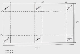
I do have a tutorial for this 3x3 mini pizza box over on my YouTube channel. Check out the video, or if you prefer pictures, here's the template.


And here's how to make the belly band:
- Cut cardstock to 2" x 8-7/8"
- Score at 1-5/8", 2-3/4", 6-1/8", 7-1/4"
- Punch both ends with Tag Topper Punch after scoring.

Hope you enjoyed this project! If you want to give it a try, let me know if you have any questions.

Happy Stampin'! :)

Wednesday, May 7, 2014

CCC#032: May 2014 Cards Challenge - Rock-a-Bye Baby

CCC#032: May 2014 Cards Challenge
Rock-a-Bye Baby

This month's card challenge is all about the bambinos! And let me tell you, the timing on this couldn't have been better! A friend of mine just had her third baby a couple days ago, a former colleague is having her first baby this summer, and a dear friend from college is expecting twins! Let's just say this card will be put to good use! :)


I've told you before how much I love this stamp set. It's called Baby, We've Grown and I think it's just super cute. I love that it's a little bit unique compared to a lot of of baby stamps. And guess what! This set is in the Occasions Catalog, but it will be returning for the 2014-2015 Catalog! :)

I stamped the "sweet baby" sentiment repeatedly on Pistachio Pudding cardstock in Pistachio Pudding ink. Isn't it cool how it sort of interlocks with itself? Of course, I used my trusty Stamp-A-Ma-Jig because I can't line things up! ;)


I love this little owl family because they're quirky and not cutesy. I colored them with a blender pen and Pistachio Pudding, Pool Party, and Summer Starfruit inks. (P.S. I used a few retiring products on this card. Summer Starfruit is a retiring color, and the DSP I used is from the 2012-2013 Catalog, I think.) 

So that's it from me! Go over to Catherine and Cathy Create to see what the other design team members have come up with. Then share your baby card and you might win a Stampin' Up! prize!

Happy Stampin'! :)

Thursday, May 1, 2014

PLxSU and Project Life Cell Phone Photo Resources

So you want to use all your awesome everyday photos in your Project Life album? Yay! But, if you're anything like me, you probably find yourself reaching for your smart phone more than your Cannon or your Nikon, right? Well, fear not! Let's finally get those photos off your phone and into a beautiful scrapbook!

I get photos from my DSLR camera printed at a local photo and art supply store because I love their print quality. Now, don't get me wrong, I know that my iPhone can certainly take some very good photos! But most of mine are taken in the evenings in not-so-stellar lighting conditions. I also organize my Project Life spreads weekly (see more about how I do PL here) so I'm printing a lot of photos and I want to keep my costs down. So I use photo printing apps right on my phone - They're quick and easy and inexpensive!


PostalPix

The app that I use for most of my photos is called PostalPix. It's another free app that lets you upload photos straight from your phone. Then they mail your prints right to your door! It's not stellar quality, but it's certainly not bad, and it suits my purposes just fine. They offer several print sizes - I use them for my 4x6 and 4x4 prints. I think the 4x4's will be fun to play with since the Stampin' Up! Project Life page protectors are the first to have 4x4 pockets! 

Prints will run you about 20¢ to 30¢. Shipping is reasonable, and shipping time is generally quite fast.   You can pay with PayPal or a credit card. The app is very user-friendly and it doesn't take much time at all to get your prints uploaded. 


Kanvess

If you have an Instagram account (it's a cool photo editing app that I, for one, am obsessed with), there's a really great app called Kanvess that pulls photos directly from your Instagram feed. It's the same deal - pay through the app and they send your photos to you. They only have one option: just-under-3" square prints with a white border that are totally adorable. (I love this size when I want to put a photo and a short bit of journaling on a 3x4 card.) Their prints are slightly more expensive, but they send coupons with your orders sometimes and their customer service is top-notch. (They replaced two orders that got lost in the mail free of charge, no questions asked!) The quality of the prints is quite nice too. 

Now let's talk about prepping your photos for printing. The original idea of Project Life was for 4x6 photos with 3x4 journaling cards. The very first page protector design (Design A or, as Stampin' Up! is calling it, Design 1) is four 4x6 photos with spaces in the middle for four 3x4 journaling cards - one card to journal about each of the photos. Project Life has come a long way since it's first days (although I have to say this stalwart is still one of my fave page designs), and it can truly be whatever you want it to be. I've already talked about 4x6, 4x4, and 3x3 photos, but I also like to use 3x4 photos. If you print your photos at home, you can resize them in your editing program and print at whatever size you like. But what if you, like me, don't print your own photos at home? 

To get my 3x4 photos, I put two photos on one 4x6 print. Now hold on, bear with me. It's way easier than it might seem!

Becky Higgins' blog (she's the creator of Project Life) recently featured a great tutorial on how to get two 3x4 photos on one 4x6 print. You can see the whole blog post here: http://bit.ly/1pUhopa That post describes several ways to accomplish 2 photos on one print in many different popular photo editing programs. But since we're talking about phone apps here, let me tell you more about the method I use.

PicFrame

The app is called PicFrame and it's another free app that's available on Android or iPhone. Once you create the 2-in-1 photo, you then save it to your phone and you can print it however you like. (Make sure to read the part of the tutorial about saving with the highest resolution!) I upload my prints to PostalPix, as I described above. Then you just cut the finished print in half. Easy peasy! :) And remember that PicFrame lets you put borders on your photos too, if you like that look. I use this app for 3x4 photos, and also sometimes to put multiple pictures on a square 4x4 print that I also get from PostalPix. 

This method is explained in more detail on Becky Higgins' blog here: http://beckyhiggins.com/wp-content/themes/beckyhiggins/assets/pdf/documents/bh_3x4on4x6_picframetutorial.pdf

Anyway, I know that's a lot of info, but my best recommendation is to download the apps and just start playing with them. It took me a while to get onto a system, but I've found that these apps work really really well for me.Give me a holler if you have any questions! And don't forget - you can order Project Life by Stampin' Up! starting TODAY (May 1)!! Check out my video for more information on how I do Project Life, and for a guided tour of the new Project Life by Stampin' Up! line. You can watch it below, or on my YouTube channel.


Happy Scrapbookin'! :)
CCC#031: May Challenge: Starlight, Star Bright


Welcome to the Catherine and Cathy Create monthly challenge for May 2014: Starlight, Star Bright. The challenge this month? Don't put a bird on it - Put a star on it! :)

I have a couple sets of cards that have been kicking around that I need to give to a few girls who missed a class that they had already paid for. So I decided to use this as a good reason to wrap them up all fancy-like. ;) Check it out...


I used my brayer to custom-color a piece of the rectangular Crêped Filter Paper with Strawberry Slush ink. Perfect coordination with my awesome emboss resist tag!


I used clear and white embossing powder over Coastal Cabana cardstock. The star stamp is from Perfect Pennants, by the way. Then I inked over the embossing with Night of Navy ink. Check out the video below for the how-to!  (You can also find the video on my YouTube channel, if you prefer.)


I'm trying to get out of my comfort zone a little and try out the layering trend that is all over the place lately! So I decided to busy things up a little with a splash of pink, a gold embossed monogram, and some little pieces of Sequin Trim and (retired) Coastal Cabana Ruffled Stretch Trim. (I just used a mini stapler to attach them to the tag.)

So, that's it from me! Go check out the other design team member's amazing projects on Catherine and Cathy Create! And don't forget - play along, link up your project, and you might win! :)

Oh yeah, and here's that video I promised you...


Happy Stampin'! :)