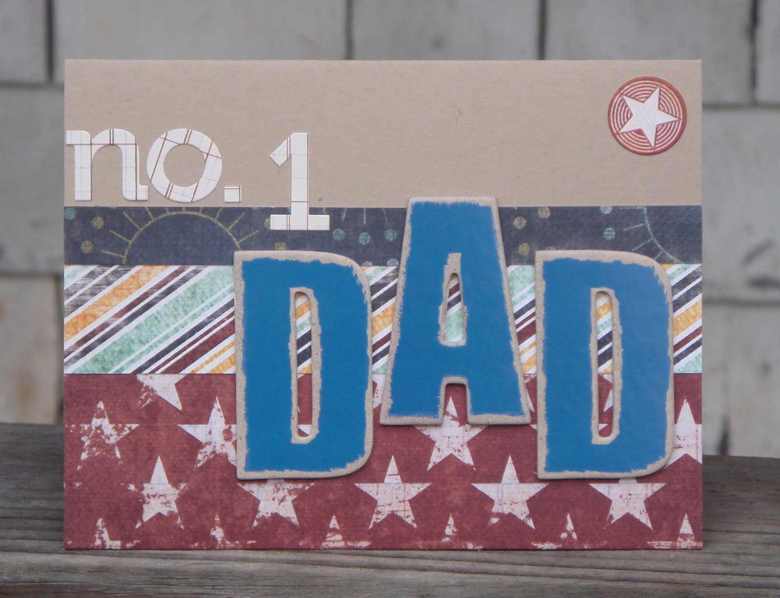
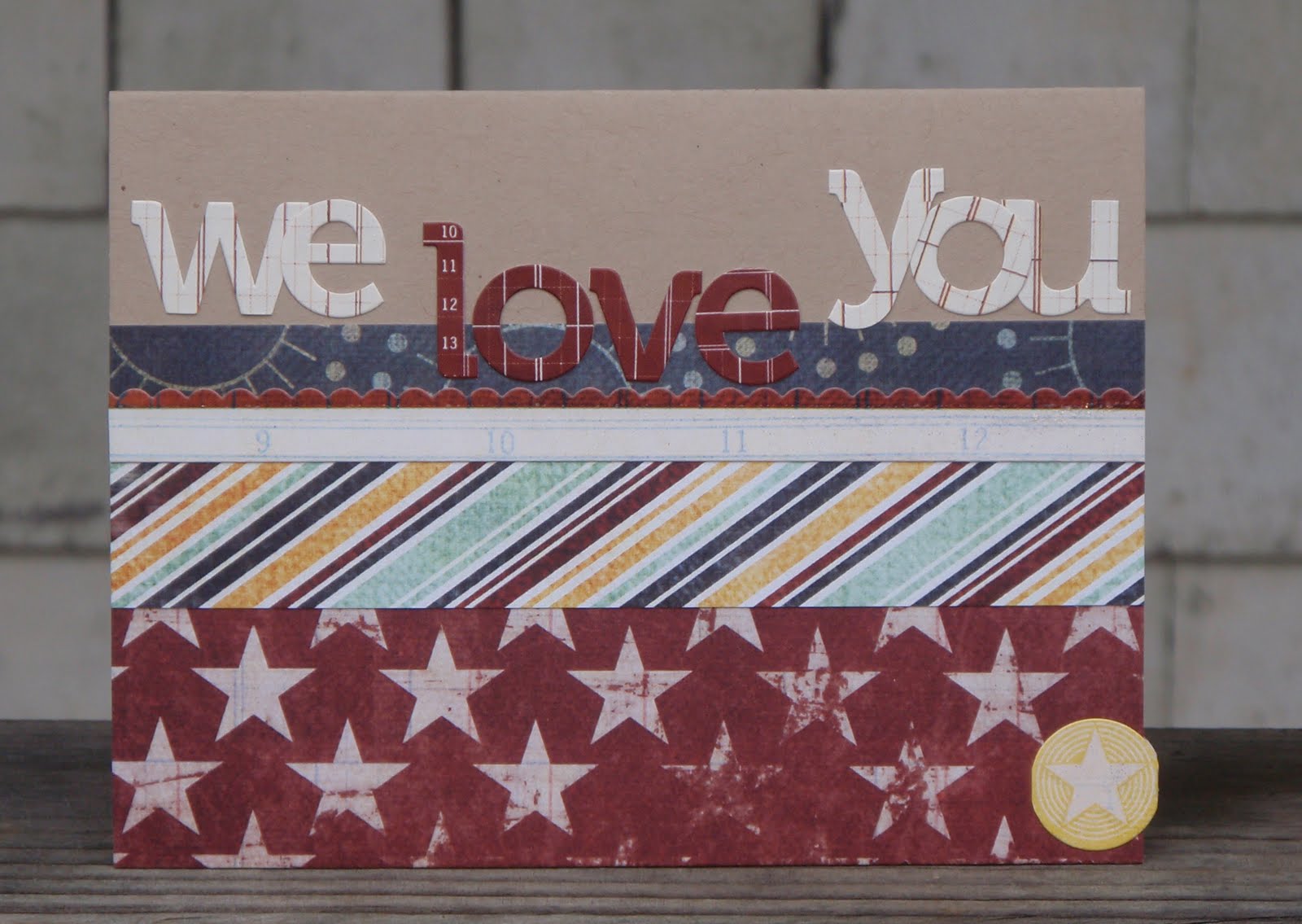
Just wanted to share a couple cards I've made recently...
With Echo Park's Sweet Summertime:
(using Laura Craigie's card, seen in my last post , as a sketch)
With Pink Paislee's Starlight:
(lifted from Erin Terrell Clarkson)
AND ... I have some exciting news! As of this week, my cards will be available for purchase at the Orleans Whole Food Store, in my hometown (and current town!) of Orleans, on Cape Cod. Janis, the store's co-owner and the mother of one of my best friends, is known locally for her wonderful selection of cards, and I'm so thrilled to be the third local artist/crafter to have cards for sale in their awesome store! Should you ever find yourself on Cape Cod, make sure to check it out! :)
Thanks for stopping by!
a little blog about fabric, paper, food, and family.
set in the charming Cape Cod town of Brewster.
perpetually covered in cat fur.
Monday, June 14, 2010
Friday, June 11, 2010
CASEing the joint
In my very first post, I wrote "My plan is to show a sketch or link to a tutorial, and then show my take." This post will be exactly that. I've been printing out a TON of photos for my Card Inspiration binder, and today I decided to let two of them guide my crafting.
This first card really isn't CASEd at all. I took this amazing card by Jen Martakis (that you can find here in the 2 Peas gallery) and I pretty much used her design as a sketch.
The original:
My version:
All supplies from Studio Calico's June kit Partly Sunny except: stamp - Hero Arts Essential Messages; buttons - Studio Calico from Granny's Cupboard
Now, this is where the CASEing comes in. I can't even begin to tell you how much I love what Laura Craigie creates. Hers is absolutely, exactly, perfectly the epitome of the style I aspire to... but I so very highly doubt I will ever get there! :) She recently posted a card on her blog that was made with last month's Studio Calico kit. I knew I had all the exact supplies she used, so I figured why not make the same card? Recreating cards I love helps get my brain used to combining and placing materials in a certain way that I'm aspiring to. Muscle memory! Right? Right?! :) I love this card and I love how my copied version came out. I think I might have to "recycle" this design as a layout or a frame too!
The original:
My CASEd card:
So that's it for me for today. Almost time for supper - veggie pizza, yum! - and Jeopardy. I hope you have a lovely weekend!
Wednesday, June 9, 2010
did I just waste all these amazing PTI buttons?
Hint: I'm hoping the answer will be a resounding no :-/
I was hoping to have a productive evening since DH is out with the boys tonight. I tried making this sketch from Paper Crafts Magazine ...
... with Sweet Summertime (still obsessed!) but since I'm still saving my pennies for a Tiny Attacher, I tried using a regular stapler and it wouldn't go through the layers of paper. And it's that stupid Staples brand "One Touch" stapler that claims it can handle up to 25 sheets! So that was ruined and I didn't feel like cutting a more strips. The base of the card with the coral layer didn't get ruined, so then I was going to make a button heart, inspired by this amazing card. But making a heart out of buttons is no small feat! So I scrapped that, and used the same base to make this. I can't decide if I like it or not. Maybe tomorrow will be more productive... I have to fast after 9pm for bloodwork so I'll need to keep myself busy! :)
Thanks for stopping by!
Labels:
cards,
inspiration,
Papertrey Ink,
sketch
I've never used {brackets} on a card before
:)
There are SO many collections out right now that use my favorite colors - leaf green, turquoise, coral, sunshine yellow. It's so exciting and I'm having a blast trying to mix and match them! So yesterday, enter Studio Calico's June kit, Partly Sunny. Not my favorite kit - didn't feel like I got as much bang for my buck as usual, but that's probably because I already had some of the items in it! - but boy, oh boy, does it ever go perfectly with some of the other collections in my stash! It doesn't take a rocket scientist to notice the similarities between the Pebbles, Inc. paper and the Buzz & Bloom fabric clouds , but I was absolutely tickled with these two items! Throw in some Sweet Summertime (didn't I tell you how smart it was of them to use white and ivory?!) and - voila! - perfection! I'm so thrilled with this card-and-envie combo!
All supplies from Studio Calico's Partly Sunny kit and Echo Park Paper's Sweet Summertime collection EXCEPT: buttons - Studio Calico (Granny's Cupboard kit); textured ivory cardstock - Bazzill; glitter brackets - American Crafts Dear Lizzy collection
Tuesday, June 8, 2010
Monday, June 7, 2010
love at first sight
Yesterday was literally the first time I have ever touched a Copic marker. As I suspected, I instantly had a separated-at-birth moment! I took an all-day workshop with Jenn at Colorful Creations on Main Street in Hyannis (Cape Cod, MA). Even if it wasn't my only LSS, I would still think it was the best LSS in the world! They recently had their 11th birthday, but somehow - I still can't believe it! - I only discovered them a couple months ago. So this was my first class - and now I can't wait to take more! They also have a studio you can "rent" and use all their stamps and dies and oh my word it's amazing. :)


Here's a little sample of what we did in the class:
The photos aren't great, but I think I did pretty well! BUT... are you ready for the ironic twist in this love story? I came home and realized I don't own any stamps that I would potentially want to color! What?! So my plan is to start saving my extra pennies, and in the meantime, head over to Colorful Creations and pillage their amazing wall of stamps. That way I can just stamp a bunch of images to color at home and use on cards in the future.
Now, if that wasn't enough, I have another new love! Introducing... Echo Park Paper! They're a new company that I just discovered, and their first collection - Sweet Summertime - is AMAZING! (Check out their facebook page for other fans' creations!) I read that their goal is to release a new collection monthly. Sounds like a tall order but I hope it's true! I ordered a few of their papers, as well as the elements stickers, just to try out the collection. Needless to say I quickly went back for the rest... it's in the mail :)
One thing I really like about the collection is that they mix white and ivory. One of my first thoughts about the collection was that it had a lot of similarities with October Afternoon's recent collections (Thrift Shop and Fly a Kite), but OA uses ivory as it's base color. So I was thrilled to see that Echo Park mixed the two because it makes it coordinate with practically any other manufacturer.
Here's my first Sweet Summertime project:
I LOVE the pinwheels! More to come soon!
Saturday, June 5, 2010
I'm DeLirious over DeLovely!
... well Ok. Maybe not delirious. But I do like this collection quite a bit - it's Delectable, Deluxe, and Delicious! Ok, Ok, I'll stop. But first, I just have to make sure... you DO know Cole Porter, right? He's the one who wrote the song DeLovely. Good song. If you haven't seen the 2004 movie named after the song, with Kevin Kline as Cole Porter, you should really check it out. The soundtrack is amazing. Great crafting music :)
Here are a few more cards I've made with the line.
(Sorry this one is so similar to the one I showed you in my last post!)
I ADORE how this one turned out! I'm not sure why the picture looks so washed out (both pictures really), as it looks awesome in my iPhoto. Oh well. Anyway... I used the DeLovely cardstock stickers sheet for this one - not an item I generally purchase for Cosmo Cricket collections, but this time, on a whim, I actually grabbed it on ebay :) The stripe above the pink paper is made with two border stickers, and a Martha Stewart felt ricrac border between them. The "best friends" label is another sticker... I learned recently you can use a sticker as a dimensional element by dusting cornstarch across the back to remove the stick (thank you Kristina Werner fans!). I was certain I was going to ruin the sticker, but I tried it and it worked brilliantly! I punched holes in the centers of the flowers, threaded the ribbon through, and stuck it on with foam adhesive. Then I added a little bling with Stickles and a My Mind's Eye rhinestone. Awesome!
Friday, June 4, 2010
a card a day?
I saw some cards posted in the 2Peas gallery today that were for a "Card-a-Day Challenge." This got me thinking... I know there's a book A Card A Day , but as I'm still new to the whole community aspect of papercrafting, I come across a lot on message boards, galleries, and blogs that I don't understand. Is there a blog out there that has a daily card challenge? That would be fun! Or was it a short-term challenge on a site or blog? I shall have to do some more googling, but I'm definitely thinking it could even be fun to just challenge myself to make one card per day, no matter whether I feel like it or not. That would be a challenge in several respects, but mostly because I usually only craft a few times a week and I often make 2 or 3 cards in one sitting. Hmm... I wonder what the rules of this card-a-day might be...
OK, I'll come back to that sometime after I've done more research and more thinking. Here are the two cards I made this afternoon...
This card has been in my head for ages and I finally got it made! I actually want to try a second one too, with different papers, but I'm not sure I have enough a's to spell out aloha again! My first project with Cosmo Cricket's DeLovely collection, which I LOVE, but am finding difficult to use.
This one is another card using Pink Paislee's Starlight collection. It is approximately lifted from Erin Terrell Clarkson's beautiful creation, but my version is simpler and more streamlined, partially because I just don't have all those gorgeous do-dads like she used! I had a hard time getting the penants to fit, and consequently the blue button isn't centered, which I sort of can't stand but otherwise I'm pleased with this card!
Thanks for stopping by! Enjoy your weekend!
Thursday, June 3, 2010
three cheers for the red white and blue
I said it before and I'll say it again: I LOVE red, white, and blue! I also love variations on the combo... turquoise, coral, aqua, ivory, maroon, navy...
I snatched up this awesome dress - from LL Bean of all places (find it here in three adorable colors) - for my friend's wedding coming up later this month. Coral, white, navy. So chic!
The only shoes I have that would go with it are silver, which I knew would be fine, but I thought might look a little bit random. And what better way to tie silver into an outfit than with jewelry? :) So I found a cute starfish charm, dug through my huge stash of beads I haven't touched since 1999 (lol) and came up with this:
I was so psyched with how it came out, and I've been considering creating a second etsy store to sell home decor items, jewelry, and girls' hair accessories, so I decided to go for it! Here's my first item... (and please check out Little Olive Designs - named for my cat!)
This one is *actually* red, white, and blue - with that gorgeous clear aqua thrown in for good measure! :) I am LOVING the nautical look this year - it seems to come back every spring/summer so it's definitely a no-fail option. And what could be cuter - and more effortless! - than this adorable necklace with great cropped jeans, a white tee, and a navy cardigan?! I'm partial to this one from J Crew ...
*wink wink* ;)
Thanks for stopping by! Enjoy your weekend!
Labels:
fashion,
inspiration,
J Crew,
jewelry
Wednesday, June 2, 2010
~ star light ~ star bright ~
I got Pink Paislee's Starlight mini collection as soon as it was available. It's founded on red, white, and blue - one of my favorite color combos even though I'm not terribly patriotic! - with pops of yellow and turquoise, and tons of stars. I've loved it since I first saw it! But it just sat and sat on my shelf because I couldn't figure out what to do with it! I've only seen a couple examples of what others have done with the collection, but I was so impressed with the variety they produced. So I sat down last night with the intention of making some Father's Day cards for my etsy store, and spread all the materials out around me. I started with a dad card, and then decided to see if I could replicate some of the amazing variety I've seen from this collection. Here we go! Thanks for stopping by!
Labels:
cards,
Pink Paislee
Subscribe to:
Posts (Atom)