Thursday, July 29, 2010

more origami wreaths

I was thinking about trying to do my own photo tutorial, but I figured it'd be nicer (and easier, haha!) to just share with you the youtube tutorial that I learned the project from. This is from shaleesdiner.


And a couple tips and tricks I've discovered:
     1. DO use a bone folder... And crease every fold well!
     2. When you fold an edge up to another edge or fold, leave yourself a little room. Don't fold it up so it's touching the other edge/fold, because you're going to have to fold a lot of layers together and you need the wiggle room.
     3. I think I've figured out a good way to glue the pieces together. I've been using my Tombow Mono Multi glue, mostly because it's tip fits in between the pieces and the Elmer's tip does not :) But you go through a lot of glue per piece, and the Tombow glue isn't cheap, so I'm going to try to find another type of glue with a pointy applicator tip. I glue in between the points in each of the little "pockets" and underneath (in the center) between the pieces. You just want to make sure your squirt of glue is large enough that it touches both pieces of paper. If you use glue that dries clear it will be visible, but only if you're looking for it. So here's my best attempt at photographing where I like to glue the wreath together (L - top view, R - bottom view)...
     4. I like to use 12 folded pieces for my wreath. I really like the size it creates... large enough to stand alone, but still small enough to hang on a Christmas tree. Although obviously you can make it slightly smaller or larger depending on how tightly you join the pieces.
      5. So far I prefer one-sided papers for this project, just because they're a little thinner and easier to fold. 6x6 or 8x8 paper pads are great for this project because you can get 2 pieces per sheet of paper. HOWEVER, if you want 12 pieces or more, you're going to end up using a good chunk of your paper pad!

So here's what I've been doing so far...

(Sassafras, October Afternoon, Girl's Paperie)

(Cosmo Cricket's DeLovely, and my wash yard)

And here's an idea I'm totally loving right now... Using materials that are not, strictly speaking, Christmas related to make Christmas projects. These two wreaths were made from Cosmo Cricket collections: Material Girl and Garden Variety respectively.

(with Prima E Line flowers)

(with Jenni Bowlin and Basic Grey buttons)

Here's a closer shot of the first one I made... You can see how it doesn't look any different from the others... That's because there really is no learning curve with this project. You won't have to waste supplies and time trying to figure it out!

(Echo Park Paper Co.)

Have fun!

I made it to CHA after all!

... And with the Cosmo Cricket team to boot!

:)

(And, if I'd remembered that Cosmo Cricket had this adorable idea to take all their facebook fans along "in spirit," I probably wouldn't have made that photo my profile pic! Haha!)


Wednesday, July 28, 2010

introducing my newest obsession

... the origami paper wreath!

I'm still in love with the Memory Keeper photo envelopes that I showed you earlier this week, but this afternoon I ran out of tape runner. The nearest craft store is 30 miles away and I literally have $3 until Friday! Soo... sadly, there will not be much paper crafting for me in the next 2 days :(

I recently found a tutorial for an origami paper wreath. Like the Memory Keeper, it's so super simple and the results are so striking that you'd never guess how little effort it takes. I've made a bunch of them just since last night... It's so fun picking out combinations of patterned papers and they're really super cute whether you embellish them or not. Here's a large wreath that I made with Cosmo Cricket's Material Girl line, and I embellished it a lot :)


OK, so the letters are a little bit wonky and it kinda bugs me. But, as I keep telling myself (especially when the layers on my Memory Boxes aren't perfectly centered!), I'm really hard on myself and I need to remember that I am a human being making these items by hand without any help from machines. Other people don't even notice what drives me crazy and I need to always be proud of what I create.

I'll be back later with a tutorial and some tips I'm discovering as I make these wreaths. Hopefully I'll also have taken some pics of the other wreaths I've made!

Thanks for visiting!


Monday, July 26, 2010

ok, make that my CHA {top 7}

;)

Can't wait for these from The Girl's Paperie!!

Toil and Trouble


Tinsel and Twig

I got invited to do my first craft fair today! But it's in August and I just can't afford (time or money!) to get myself ready for a fair in a month. But the woman who's running it is also running another one in December and I'm shooting for that one. So I'm psyched that I have a legit reason to be itching to get my hands on Christmas product in July :) My hubby always likes to compare me to Veruca Salt, but I can't help it... I WAN'T IT NOW!! :)


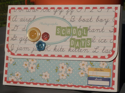
memory box project

Heads up folks - This is a GREAT project! Couldn't be simpler and you get such striking results! You gotta give this one a try!


This is the Memory Box project from StampTV. The idea is that you can use the little cardstock box as a storage option for photos you want to scrap, or it can be a permanent "album" to store photos from an event or a period of time. (P.S. "Mes voyages" means "my travels" in French.)

Here's another one I made for Christmas photos:

And two for school photos (this was my lightbulb moment... in my opinion this project is perfect for storing favorite photos by school year!):

You will really not believe how easy it is to make these. I made all four of the projects above over the course of one day - really in a matter of a few hours. Once you've got all the pieces cut it literally takes minutes! All you need is one sheet of 8.5 x 11 cardstock (I'm finding that heavier is better, though adding the layers of paper help to stabilize the box), the scoring template (found here listed under "Memory Keeper Template"), some patterned paper and/or solid paper/cardstock (any weight is fine for the two layering pieces), some tape runner, some super sticky tape (Scor-Tape or, as I used, Therm-o-Web Super Tape), and a scoring board. And then, of course, whatever embellishments you want :)

First step:
Cut all your pieces of layering paper.
Layer 1 (I used solid colored cardstock):
1 @ 6.25" x 2.75"
1 @ 6.25" x 4.25"
1 @ 6.25" x 2.25"
Layer 2 (I used patterned paper)
1 @ 6" x 2.5"
1 @  6" x 4"
1 @ 6" x 2"

Second step:
Score 8.5x11 cardstock according to template. Adhere layers together and then to the box. Fold on score lines.

Third step:
Assemble box with super sticky tape.

Fourth step:
Determine a closure. I used a small bit of adhesive magnet on one and ribbon on the other.

Check out the videos below for more detailed directions of how to assemble the box.


Sunday, July 25, 2010

Gina K. Designs Blog Hop

Here's another StampTV inspired card for Gina K. Designs Design Team Blog Hop. This card is about as simple as it gets, but I like how it turned out.

I used a couple StampTV videos as inspiration for these: Adding a Button to a Bow, and the way Gina makes the focal embellishment for her Journal and Pen Set.


Supplies:
Cardstock: Gina K. Designs (from Pure Luxury Holiday Assortment)
Stamp: Blessed is the Season by Gina K. Designs
Inks: Colorbox Chalk in Chestnut Roan, Distress Ink in Vintage Linen
Misc: twill tape, baker's twine, button, Nestabilities Labels 8, Spellbinders Wizard

Thanks for looking! :)


Are you sick of Christmas yet? :)

I'm still goin' strong with these clean and simple Christmas cards! I had fun yesterday and today watching Christmas in July on QVC (my guilty pleasure!) and crafting away. If you haven't figured out yet, I have a tendency to find something I really like and roll with it... variations on a theme if you will. You still get the satisfaction and emotional therapy of creating, but by taking the same basic design and just changing a couple little details, you don't have to put a ton of thought into your project. Plus, my desk is a mess and it's so much easier to just keep using what's in front of me than it is to clean up :)

This one was inspired by that candy cane stripe paper, which I got last year at Paper Source. Love it!

And here's the variation... more patterned paper, a little twine, and some Frosted Lace Stickles on the stocking. Easy peasy.

The next two cards are the first I've made with the pine green cardstock from the Gina K. assortment. It's got a nice texture to it that I like, and a good weight for layering and holding up as a card base. The color is a little on the peacock side for my preferences, but it's nice. I used a couple StampTV videos as inspiration for these: Adding a Button to a Bow, and the way Gina makes the focal embellishment for her Journal and Pen Set.

 I made both tree embellishments using the ivory cardstock and Antique Linen Distress Ink.


Making these cards has been an interesting experience for me. I don't actually do a lot of stamping in my cards, and I'm discovering I'm really not that good at it! :) Pretty much every card I've made I've had to remake at least one piece a couple times because of smudging or my Stamp-A-Ma-Jig slips or something like that! Creating a card with nothing but stamps, ink, solid-colored cardstock, and adhesive is actually a lot harder than it looks! :)


Saturday, July 24, 2010

I {heart} HANSON!

The Hanson concert tonight was amazing! We had SO much fun :)

The girl in front of me had a new Canon Cybershot camera with 10x zoom (the smaller point-and-shoot kind) and she got amazing close-up, crisp, clear photos no matter what the stage lighting was. Jealous! But after trying to take a decent photo on my little Olympus Stylus - which I love, don't get me wrong, but it doesn't do indoors or dark very well - I realized the important thing was not to be able to prove later on that I had been there, but to enjoy being there. And what a great show it was!

BUT, I did shoot a super fast, not very good quality at all video of quite possibly my favorite Hanson song of all time :) Sorry it's so jumpy - I was rockin' out!


Friday, July 23, 2010

Gina K. Designs - Design Team Blog Hop


The winner of this Blog Hop will be the guest DT member for the August release! I'm so new to StampTV that I'm sure my chances are teeny-tiny, but it's fun to participate anyway! :)

The challenge is to create a card inspired by a StampTV video. I chose the Reverse Nestabilities technique video, and I used my very first (of many I'm sure!) Gina K. Designs stamp set: Blessed is the Season.


Supplies:
Stamps: Blessed is the Season by Gina K. Designs
Cardstock: Pure Luxury Holiday Assortment by Gina K. Designs
Buttons: Pink Paislee (cork), Creative Cafe (red)
Ink: Colorbox Chalk in Chestnut Roan
Misc: Stickles (Frosted Lace), baker's twine, Nestabilities Labels 8, Spellbinders Wizard

Thanks for stopping by my blog!


adventure album

I found this great kid-friendly project in the most recent Family Fun Magazine. This would be great for any summertime family adventures you're planning or have already taken. Or it would also be an awesome album to add to your collection even if you don't have kids (like me)!


Map-Envelope Book
(Family Fun, August 2010)

Materials:
Envelope template (download it here)
1 large map (or several small ones)
glue stick or tape runner
small hole punch (1/8 or 3/16)
brads

1. Use the template to cut envelopes from the map. (The book in the photo above is made from three envelopes.) To assemble the envelope, fold in flaps A and B so that they overlap in the center. Adhere them together, then fold over flap C and adhere that down.

2. To assemble the book, stack your envelopes and punch two holes through the sealed ends, 2.5 inches apart and 1/2 inch from the edge. Use the brads to hold the envelopes together. Secure each envelope by folding over its open end, punching a hole through it, and closing it with another brad.

Obviously you can customize the configuration of the book - the binding, how the envelopes close, etc. - however you like. Tuck memorabilia into the envelopes, and you can decorate and add photos and journaling over the maps as well. So cute!


Have fun doing projects with your kids this summer! :)


Thursday, July 22, 2010

we need a little Christmas

It hasn't snowed a single flurry but Santa, dear, we're in a hurry...

Do you know that song? It's from Mame, which is one of the very few musicals I have never seen any incarnation of and don't know a thing about. But that song has been stuck in my head off and on for weeks now! :)

I made two more cards using my Gina K. Designs purchases this afternoon, after sleeping until 10:30 and then lazing around in my nightie until 2pm! :)

This time I focused on the beautiful tree stamp and I used a color combination of red, ivory, and brown.

This card was inspired by my recent StampTV youtube marathon, this video in particular. The technique is nothing new, but it's not something I usually think to do. You can see the dimension a little bit better in this photo:
I used the ivory cardstock, which I'm thinking is probably the layering weight but is good and heavy and works great for a card base. It has the ideal smoothness-to-"tooth" ratio that I like for stamping. The color is a really nice ivory too. And the red is a nice heavy weight with a subtle stripe texture. Two thumbs up for both! I added a little bit of Frosted Lace Stickles over the trees and under the snow. The button in the bottom corner is a cork button from Pink Paislee's 365 Degrees collection. I had a hard time getting it to stick over the twine - thank goodness cork is flexible!

I think I was channeling Gina K.'s minimalism when I made this card... and also trying to make the very best use of a small inventory of cardstocks. The ivory background is embossed with Cuttlebug's swiss dot folder. I couldn't figure out where to put a sentiment, so I did something I never do - I put a sentiment on the inside! :)

Tomorrow's Friday and I have to work (boo) but then DH and I are going to see HANSON in concert! Yup, Hanson's still around, and they're even more awesome than ever! If you haven't heard it yet, you should really check out their newest album. You can start with this video. (I love the little kids! And doesn't Zac look like he's channeling Zac Efron trying out for Grease?)

Have a good weekend!


Thinking Inking youtube playlist

I just compiled a youtube playlist of Jennifer McGuire's Thinking Inking Class for 2 Peas in a Bucket, since I've found it's really hard to find on 2 Peas's website AND on their youtube channel.


it makes me want to wag my tail

MAIL! :)

Yesterday was a good day - well, in the mail arena at least. I ordered my first stamp set from Gina K. Designs. I recently discovered her store and her StampTV site - probably through a youtube video or something. Her style is clean and graphic like mine, but her cards are all kind of the same... the best word I can think of is uninspired... They're lovely and well made but all just layered solid-colored cardstock and stamps. I like more patterned paper and embellishments and stuff. But her videos are great - There's just something about her over-the-top bubbly charm that I'm loving! So I followed their July release and fell in love with the Christmas in July stamp set.
It's called Blessed is the Season... I'm not at all religious, so I don't usually go for stamp sets with scripture and sentiments that mention God. But, on the one hand, if I'm trying to promote my etsy store better, there's a huge market for religious cards. On the other hand, the less shrewd hand, I love this stamp set! The images are lovely and simple and I adore the mix of fonts.

Now, I don't really do enough stamping to be able to give a fair review of how these stamps compare to others. I've only used a couple so far. I had a little trouble with the block of text inking up properly, but when I switched to a different ink pad it worked just fine.

I also bought a holiday themed cardstock assortment to try out Gina K.'s Pure Luxury cardstock.
Here's my biggest complaint with it: The description is "Contains 5 sheets of 5 Pure Luxury card stock colors in assorted weights and textures." OK. Isn't the idea of a cardstock assortment to get you to buy more in the future? What if I love what I get? I won't know what to reorder if they don't tell me what I'm using! And how do I know which of these cardstocks are appropriate for various projects? Pure Luxury has a base weight and a layering weight and they're not necessarily interchangeable. So far I've only used the white, which I'm pretty sure is the base weight. I really do like the weight of it, but it's so smooth that it's almost glossy, which I don't love. It seems to stamp nicely, but I had some trouble getting my favorite Colorbox chalk ink to dry, which led to smudging and having to re-stamp over and over. (Now I understand why Gina K. uses dye ink in her videos!) I'll let you know how the other cardstocks work out, and if I figure out which one's which!

In the meantime, here are my first two projects with Gina K. Designs products. I used emboss resist on both, with Tim Holtz Distress Ink in Broken China. (If you're not familiar with this technique, you must check out Jennifer McGuire's Thinking Inking class for 2 Peas!)

This is my favorite stamp in the set - which is a little weird considering I don't usually go for the religious sentiments. For some reason I just love the concept of a "conspiracy of love"... I don't know if it's from somewhere in particular but I love it. Rather than using one focal image, I wanted to make a super simple card with the sentiment as the focus. (The navy cardstock is from Paper Source; I used Gina K. Designs and Bazzill white cardstock.)

On this card I did emboss resist on the dove after stamping the text block stamp in gray. This was where I had trouble with the text stamp, but I think it was really the gray ink. This is more in keeping with Gina K.'s style of cardmaking. It makes me wish I had more Nestabilities so that I could create thinner borders, but I kept the 1/4" border fairly consistent so I don't hate it. But I'd rather have a 1/8" border! The white background is embossed with the paisley Impressabilities.

More to come soon from this stamp set! I'll let you know how I like it as I continue to use it!

Thanks for stopping by!