Showing posts with label 2014 Occasions Catalog. Show all posts

Tuesday, May 20, 2014

Occasions Catalog Favorites: Peachy Keen


Here's a cute and simple card I made with the Peachy Keen stamp set from the Occasions Catalog, and the coordinating On Film Framelits. I also used the super fun Retro Fresh DSP collection both on my card and as an inspiration for the colors I chose.

This card is really very simple and doesn't take much in the way of explanation. The card base is Coastal Cabana, and then I layered Sahara Sand and Very Vanilla. I cut the filmstrip die with Baked Brown Sugar, and stamped on a layer of Sahara Sand which I adhered behind it. I stamped the greeting with Baked Brown Sugar, Tangerine Tango, and Coastal Cabana markers. The heart is clear embossed on Tangerine Tango cardstock, giving it a great shiny, tone on tone look. 


A little bow of gold baker's twine finishes off this cute and very mailable card!

If you like this card, you'll want to know that the Peachy Keen stamp set and Retro Fresh DSP will only be available until May 31st! That's less than two weeks! Visit my website if you'd like to place an order.

Happy Stampin'! :)

Thursday, May 15, 2014

Occasions Catalog Favorite: Vivid Vases

In every catalog, Stampin' Up! offers a small selection of single stamps. They're usually only available in wood mount, and feature an image and a greeting. Vivid Vases is one such single stamp from the Occasions Catalog, and it happens to be one that I totally adore. Now, I will be upfront with you and say that this stamp will carry over into the 2014-2015 Annual Catalog, so there's really no rush on this one. But at only $11.95 for a beautiful and generously sized stamp, it's a great addition to your order... Maybe you just need a few dollars to bump your order to the next level of Hostess Benefits? ;)


I decided to keep this card extremely simple, because I wanted the coloring to really take center stage. This set is so awesome for whatever your favorite coloring technique may be... in this case I chose to color it using inks and a blender pen. I used Pool Party, Calypso Coral, Wisteria Wonder, Crushed Curry, and Gumball Green inks. And P.S. - Gumball Green is retiring but at this time the ink and cardstock are still available so get them while you can!


Try watercoloring the stamp, or paper piecing the vases with your favorite DSP! Quick and simple, and the results are oh-so-cheerful!

To finish off my card, I used a layer of Calypso Coral, and two little banners that I punched using the banner punch from Sale-a-Bration. Guess what! That awesome little punch will be returning in the 2014-2015 Annual Catalog! I can't wait! :)

You could easily take this same card design and "step it up" however you like... Add ribbon or twine. Or maybe a button or other embellishment. Add more layers of cardstock. Emboss the card base with an embossing folder. Or just keep it sweet and simple!

Happy Stampin'! :)

Monday, May 12, 2014

Occasions Catalog Favorite: Hello, Sailor

The Occasions Catalog run is winding down: Many products from this catalog will only be available until June 1, 2014! Yes, some of them will be carried over into the new 2014-2015 Annual Catalog, debuting on June 2nd, but that is not the case with everything. So if there's something you think you can't live without, make sure you get your order in by June 1st!

I've got some cards on deck to share with you guys, so my plan is to post them over the next few days, showcasing some of my faves from the Occasions Catalog, whether they will be carried over or not. Sound good? Let's get started! :)


One of my most favorite stamp sets in the Occasions Catalog is called Hello, Sailor. It's so cute! It has awesome nautical images and sentiments. This little whale is so cute!

I also used the High Tide DSP, which coordinates perfectly with the stamp set. It has some really unique and beachy colors and motifs, but I chose to go with a more traditional palette of red, white, and blue, with some weathered gray. Specifically, I used Pacific Point, Real Red, and Smoky Slate. On the card base I used a Stampin' Sponge to ink around the edges to echo the distressed feel of the DSP.


To create the two-tone look on the adorable whale, I inked him up with Smoky Slate ink, then took a sponge dauber and sponged around his edges with Pacific Point ink. You may be familiar with this look from a technique called "rock and roll" where you roll the edges of the stamp in the second ink color. I tried that technique, but found that the blue was going further into the middle of the image than I wanted to. Using a sponge dauber solved that problem easily! (P.S. The sponge daubers are currently sold out, because they were on the Retiring List. But head's up - They're not actually retiring! They're just being reconfigured and will be back in the Annual Catalog in June.)

Oh, and the sentiment is from A Dozen Thoughts - it's definitely my favorite sentiment set right now.

So... I guess that's it for now. See you again soon - have a great week!

Happy Stampin'! :)

Sunday, May 11, 2014

Don't be so negative!


One of the easiest ways to change up how you use your Framelits and other dies is to use the negative of the die, rather than the little piece that's cut out (the piece you're "supposed" to use). That was what I wanted to do with this card, and I wanted to keep it nice and simple to really show off the technique.

I used the Word Bubbles Framelits to cut the tall and skinny bubble out of my square Coastal Cabana cardstock panel. Then I embossed the panel with the Honeycomb embossing folder. So then I basically had an embossed square piece of cardstock with a hole in it :) I put snail adhesive all around the edges of the opening on the back of the panel, and adhered a piece of the Kaleidoscope DSP behind the opening. It's simple and very striking. 


The sentiment is from the stamp set that coordinates with the Word Bubbles Framelits. It's called Just Sayin'. FYI both of these items will be carried over from the Occasions Catalog into the new Annual Catalog coming out in June! :) I stamped the tiny heart from the set randomly across the background, to soften the card a little, and punched out a heart from Crushed Curry cardstock to add to the sentiment. Easy as pie!

Happy Stampin'! :)

Saturday, May 10, 2014

Seaglass Inspired Mini Card Set

A while ago I was prepping for a class and I knew I wanted to do something a little different. I wanted to share the clear block stamping technique, and I thought it might be fun to do a little heat embossing too. Clear block stamping creates a great watercolor background, and I originally tried to pair it with some flower stamps. But I've been so into the sorbet-tones of the 2013-2015 In Colors lately... and so ready for summer to hurry up and get here! ...so I was inspired to go for a more beachy theme than I had originally planned. :)


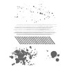
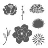
I decided it would be fun to showcase this technique with a little set of 3x3 cards. I stamped the shell images from By the Seashore in Versamark and embossed them with silver embossing powder. (So technically this card is also sort of an emboss resist technique! Bonus!) Then I used markers in different tones of the same color to create the ombre look using the clear block stamping technique. (See above for link to technique video!) 


For the pink card, I used Blushing Bride, Crisp Cantaloupe, and Calypso Coral markers and a card base in Crisp Cantaloupe.


For the aqua card, I used Pistachio Pudding, Pool Party, and Coastal Cabana markers. I wanted the card base to be Coastal Cabana cardstock, but I had run out (*gasp*) so I used Pool Party.


And then, a sandy-colored card to match the sand dollar. I used Smoky Slate, Sahara Sand, and Crumb Cake markers, and the card base is Crumb Cake.

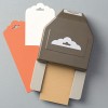
Now, a set of adorable 3x3 cards is lovely, but even better...? A sweet little coordinating box to put them in - and gift them in!


Isn't it adorable? I used a piece of DSP from the Fresh Prints DSP Stack for the top. The belly band is Crumb Cake, stamped all over with the sand dollar stamp and punched at each end with the Scallop Tag Topper punch. I love how that looks! :)


The twine is leftover from Sale-a-Bration, but guess what! This gorgeous thick baker's twine will be reappearing in the upcoming 2014-2015 Catalog in all the 2013-2015 In Colors!!! :) I can't wait!


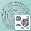
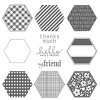
I used a sentiment from Six-Sided Sampler, embossed in silver. I also stamped the sand dollar image in Coastal Cabana, and punched the whole thing out with the Ticket Duo Punch. So cute!


I do have a tutorial for this 3x3 mini pizza box over on my YouTube channel. Check out the video, or if you prefer pictures, here's the template.


And here's how to make the belly band:
- Cut cardstock to 2" x 8-7/8"
- Score at 1-5/8", 2-3/4", 6-1/8", 7-1/4"
- Punch both ends with Tag Topper Punch after scoring.

Hope you enjoyed this project! If you want to give it a try, let me know if you have any questions.

Happy Stampin'! :)

Wednesday, May 7, 2014

CCC#032: May 2014 Cards Challenge - Rock-a-Bye Baby

CCC#032: May 2014 Cards Challenge
Rock-a-Bye Baby

This month's card challenge is all about the bambinos! And let me tell you, the timing on this couldn't have been better! A friend of mine just had her third baby a couple days ago, a former colleague is having her first baby this summer, and a dear friend from college is expecting twins! Let's just say this card will be put to good use! :)


I've told you before how much I love this stamp set. It's called Baby, We've Grown and I think it's just super cute. I love that it's a little bit unique compared to a lot of of baby stamps. And guess what! This set is in the Occasions Catalog, but it will be returning for the 2014-2015 Catalog! :)

I stamped the "sweet baby" sentiment repeatedly on Pistachio Pudding cardstock in Pistachio Pudding ink. Isn't it cool how it sort of interlocks with itself? Of course, I used my trusty Stamp-A-Ma-Jig because I can't line things up! ;)


I love this little owl family because they're quirky and not cutesy. I colored them with a blender pen and Pistachio Pudding, Pool Party, and Summer Starfruit inks. (P.S. I used a few retiring products on this card. Summer Starfruit is a retiring color, and the DSP I used is from the 2012-2013 Catalog, I think.) 

So that's it from me! Go over to Catherine and Cathy Create to see what the other design team members have come up with. Then share your baby card and you might win a Stampin' Up! prize!

Happy Stampin'! :)

Thursday, May 1, 2014

CCC#031: May Challenge: Starlight, Star Bright


Welcome to the Catherine and Cathy Create monthly challenge for May 2014: Starlight, Star Bright. The challenge this month? Don't put a bird on it - Put a star on it! :)

I have a couple sets of cards that have been kicking around that I need to give to a few girls who missed a class that they had already paid for. So I decided to use this as a good reason to wrap them up all fancy-like. ;) Check it out...


I used my brayer to custom-color a piece of the rectangular Crêped Filter Paper with Strawberry Slush ink. Perfect coordination with my awesome emboss resist tag!


I used clear and white embossing powder over Coastal Cabana cardstock. The star stamp is from Perfect Pennants, by the way. Then I inked over the embossing with Night of Navy ink. Check out the video below for the how-to!  (You can also find the video on my YouTube channel, if you prefer.)


I'm trying to get out of my comfort zone a little and try out the layering trend that is all over the place lately! So I decided to busy things up a little with a splash of pink, a gold embossed monogram, and some little pieces of Sequin Trim and (retired) Coastal Cabana Ruffled Stretch Trim. (I just used a mini stapler to attach them to the tag.)

So, that's it from me! Go check out the other design team member's amazing projects on Catherine and Cathy Create! And don't forget - play along, link up your project, and you might win! :)

Oh yeah, and here's that video I promised you...


Happy Stampin'! :)

Saturday, April 26, 2014

Technique Video: Using the Hexagon Hive Thinlit Die as a Stencil

Hey there! Today I have another quick video tutorial to share with you. I made a card for a recent class where I used the Hexagon Hive Thinlit die to create a stencil. I used sponging to get a really fun and totally on-trend ombre effect. Check it out!


Pretty simple card, but what a great look! I also used Gorgeous Grunge to add even more texture to my card front. The sentiment and the label I stamped it on are from the Chalk Talk stamp set and dies. (Get them as a bundle to save 15%!) Easy-peasy! :)

Check out the video below, or over on my YouTube channel. Have fun with this technique! What other dies can you use as a stencil?


Happy Stampin'! :)

Friday, April 25, 2014

Retirement Party! Part Two


This is a card I made a few weeks ago for a class that I wanted to teach emboss resist in. I hadn't got around to sharing it yet, and now a bunch of the products I used are retiring! :( Let me give you the low-down...

The flowers are from Simple Stems, which is in the Occasions Catalog and will be available until May 31st. But if you like them, get your order in TONIGHT for FREE SHIPPING! I clear embossed them onto Whisper White Cardstock, then sponged on Summer Starfruit, Pistachio Pudding, and Baked Brown Sugar inks. The embossed areas resist the ink, leaving the white showing through where you stamped! Awesome! :)

The retiring products I used on this card that are still available (as of when I'm writing this post) are...
- Field Flowers (for the sentiment) - only wood-mount is left, and remember, these could disappear at any moment!
- Summer Starfruit ink
- Sponge Daubers (Stampin' Up! is the only place you can buy 12 of these at a time! $10.95 - what a deal!)
- Scallop Trim Border Punch

Get 'em while you can if you're interested! Place an order on my website or email me. Remember! FREE SHIPPING ENDS TONIGHT!

Happy Stampin'! :)

Sunday, April 20, 2014

Technique Video: Painter's Tape Technique

Hello friends! Happy Sunday! Happy Easter! Happy Passover! Happy All The Days! :)

It's a bright and sunny day here on Cape Cod and it's a welcome change from the 3 or 4 days of below-freezing temps we've just had. I'm wearing my favorite shades of mint and I got to go shopping for baby hat yarn yesterday and I'm happy!

And you know what else makes me happy? Fun new inky techniques! So I'm here today to share one with you. This one's called the Painter's Tape Technique. It gives a beautiful bold result that's great for card backgrounds. And it's just the right amount of messy! LOL :)


Here's the card I created to showcase this technique. I wanted to use the Hello, Sailor stamp set, so I was going for a nautical look. What says nautical better than bold stripes in red and blue?

(P.S. I used the Sale-a-Bration punch for the little banners, but you could just as easily cut them by hand. And the button is retired - sorry! Swap it out for the Basic Metal Buttons in the Occasions Catalog for a similar look.)

You can check out the video below, or over on my YouTube channel. I hope you have fun with this technique!


Happy Stampin'! :)

Monday, April 7, 2014

CCC#029: April Cards Challenge - Blue Skies and Yellow Highs


The April Cards Challenge from Catherine and Cathy Create is called Blue Skies and Yellow Highs! Inspired by longer days and spring weather, the challenge is simple: Use blue and yellow on a card.

Today could not be a more perfect day to be writing the post for this particular challenge! We have had sunny, warm weather two days in a row, which is so wonderful after the bitter cold and snowy winter we had here on ol' Cape Cod. We've had the windows open, laundry on the line, and time to spend outside! :)


This is a simple color challenge, yes, but I often find that the more open-ended the challenge, the more difficulty I have getting started. I was browsing Pinterest when I found this picture...

    
... and I was immediately inspired! I got the idea of using multiple sizes of circles from the mobile hanging above the chair. I love the pale color scheme, as well as the pops of gray. And chevrons! :)

I used Jennifer McGuire's "iron off embossing" technique for the background. It's hard to see in the picture but it has a great matte finish and allowed me to stamp Gorgeous Grunge over top of the emboss-resist background. The large polka dot and stripe circles are from the stamp set from February's Paper Pumpkin kit.

Thanks for stopping by today. Now head on over to Catherine and Cathy Create to see what the other DT members made! Link to your yellow and blue card and you could win a prize from Stampin' Up! Have a great week!

Happy Stampin'! :)


Blue and Yellow Happy Day Card Supplies 


Tuesday, April 1, 2014

CCC #028: April Challenge - Fresh Beginnings Photo Challenge


Happy April! No foolin' - It's time for another Catherine and Cathy Create Monthly Challenge! :) This month we have a spring inspired photo challenge. It can be anything inspired by this photo...


As I've said in the past, I like to use the monthly group challenge to do something other than a card. So far, it's usually been some sort of 3D item, and this month is no different. Check out my take on the photo...


I decided to make a cute little treat pouch with a coordinating tag. I used one of the mini muslin bags (love these!) - I'd been wanting to try heat embossing on them for ages now!


I cut a square of cardboard to fit inside the bag so the ink wouldn't go through to the back side of the bag, and to help it lie flat. I used blue painter's tape to mask off stripes across the front of the bag, and then I generously pressed my Versamark pad all over the bag. I removed the tape quickly, then sprinkled Pool Party embossing powder over the whole thing. Then I just heat set it like normal! (Wait until you're completely done with the process before you remove the cardstock from inside the bag.) Eh voilà! An adorable striped muslin bag with great texture. I also replaced the plain drawstring with Primrose Petals ribbon to coordinate.


The tag is stamped with the Simple Stems stamp set. The sentiment is from Six Sided Sampler. I used a new-to-me technique - "the filter paper technique" - to get some great texture on the stamped image.  Here's a close-up of the tag.


Isn't that pretty? It sort of looks like the Mulberry Paper that Stampin' Up! used to sell. I'll be doing a video on this technique soon. :)

So that's it from me for today. Make sure you stop by Catherine and Cathy Create to check out all the inspiration from the Design Team... This is one not to be missed, trust me! :) If you're inspired to play along, make sure you link up your project because you might win some Stampin' Up! goodies! Enjoy the rest of your week.

Happy Stampin'! :)


Supply List